Looking for the best Power BI dashboard examples to simplify data-driven decision-making? You’ve landed on the right page.
According to one study, a whopping 87% of people consider data preparation a critical task. That’s where Power BI shines.
Whether your data is in Excel or a complex cloud-based warehouse, business intelligence & data visualization tools like Tableau, Grafana, Qlikview, Power BI transform it into easily digestible, actionable insights.
In this guide, we’re walking you through 15 stellar Power BI dashboard examples that simplify decision-making, improve KPIs, and empower teams.
Let’s go ahead and get started.
-
Best Power BI Dashboard Examples
- 1. Airport Authority Performance Power BI Dashboard
- 2. Customer Analysis Power BI Dashboard
- 3. Global Superstore Retail Power BI Dashboard
- 4. Cancer Analytics Power BI Dashboard
- 5. Pharma Sales Analysis Power BI Dashboard
- 6. HR Analytics Power BI Dashboard
- 7. Executive Insights Power BI Dashboard
- 8. Inventory Stock Analysis Power BI Dashboard
- 9. Electricity Energy Usage and Cost Power BI Dashboard
- 10. Sales Scorecard Power BI Dashboard
- 11. Social Media Monitoring & Analytics Power BI Dashboard
- 12. Attendance Tracker Power BI Dashboard
- 13. Team Performance vs. Target Power BI Dashboard
- 14. NFL Fantasy Football Player Comparison Power BI Dashboard
- 15. Seattle’s Construction Climate Power BI Dashboard
- What Makes a Good Power BI Dashboard?
- What are Some Common Mistakes to Avoid When Designing a Power BI dashboard?
- Best Power BI Dashboard Examples – Wrap-Up
Best Power BI Dashboard Examples
1. Airport Authority Performance Power BI Dashboard

The Airport Authority Performance Power BI Dashboard gives a clear and user-centric view of all critical data. Airport management authorities can use quickly make data-driven decisions where there are
- Flight changes
- Emergencies
- Delays
What does this Power BI Dashboard Does
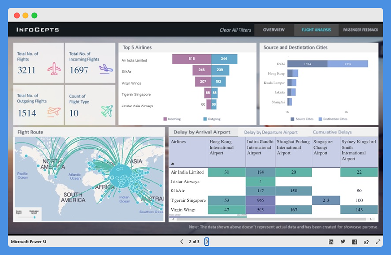
This Power BI dashboard overview offers quick insight into critical key metrics including
- Total flights (incoming and outgoing flights)
- Total delays (arrivals and departures)
- Ground handling time – Queuing, Processing, and Clearance time
- Passengers satisfaction index
With this dashboard, users can study the most popular flight routes, the top five airlines, for incoming and outgoing flights. The dashboard also provides data about the source and destination cities of major airliners.
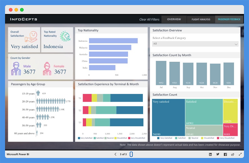
This Power BI dashboard features a passenger feedback section and offers an insight into the
- Number of passengers by gender and age group
- Top Nationality
- Satisfaction experience based on terminal and month
- Total satisfaction count and more
This Power BI dashboard can help airport management
- Evaluate operational processes
- Discover bottlenecks
- Identify areas for improvement
People’s Response to This Power BI Dashboard
- This dashboard offers detailed actionable insights into airport operations activities.
- Page backgrounds are incredible.
Explore: Best Tableau Courses
2. Customer Analysis Power BI Dashboard
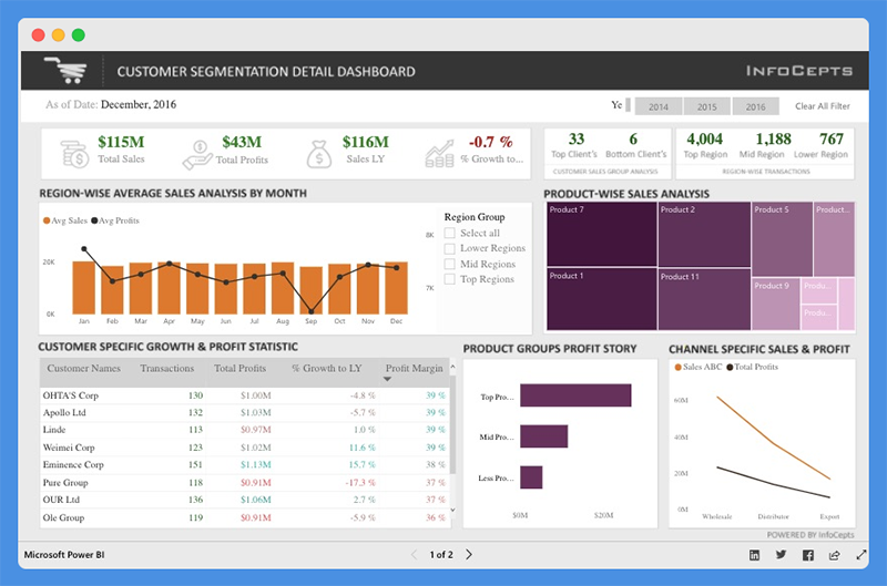
The Customer Analysis Power BI Dashboard offers valuable insight into product sales and profit for regional customers. Managers and business leaders can use this Power BI dashboard to analyze business growth across regions.
They can evaluate profit distribution across customers, make valuable decisions to increase revenue, and drive profitability.
What this Power BI Dashboard Example Does

This dashboard provides details about total sales, total profits, last year sales, and percentage growth. You can use the filters to view data for different years. With this dashboard, managers can gain key insights into
- Product-wise sales analysis
- Customer-specific growth and profit statistics
- Channel specific sales and profits
Customers can use charts to
- Compare total sales and profit margins
- Analyze client segmentation and product performance
People’s Response to This Dashboard
- The icons and color combinations are excellent
- The dashboard is useful for sales and marketing teams
You Might Want To Read: Best Tableau Sales Dashboard Examples
3. Global Superstore Retail Power BI Dashboard

The Global Superstore Retail Power BI Dashboard offers a 360-degree picture of overall sales performance. Managers can use this Power BI dashboard to set performance targets, track KPIs, and measure results.
What this Power BI Dashboard Example Does
The dashboard has a single-screen display and offers actionable insights into key elements. Users can view detailed analyses and information including
- Total sales, profit, and profit ratio
- Sales by country
- Sales by category and subcategory
- Total sales by city and more
People’s Response to This Dashboard
- This retail Power BI dashboard highlights critical information.
- The dashboard is clean, easy to read, and offers powerful key insights.
Worth Reading: Best Tableau Retail Dashboard Examples
4. Cancer Analytics Power BI Dashboard
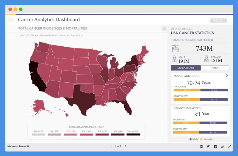
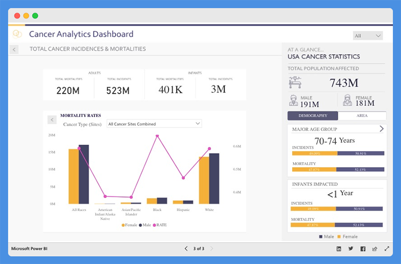
This Power BI dashboard tells a story about cancer patients in the USA. With this dashboard, health agencies can
- Make informed decisions
- Establish policies to manage cases and track recoveries
What this Power BI Patient Analytics Dashboard Does

The Cancer Analytics dashboard shows total cancer incidences and mortalities. Users can view the total population affected, and the numbers of people affected based on demography and area.
The Power BI dashboard helps you understand the incidences and mortality rates associated with each cancer type. You can hover over any state to find out the number of affected victims.
People’s Response to This Dashboard
- The dashboard is intuitive and visually appealing.
- It provides valuable data for government use.
5. Pharma Sales Analysis Power BI Dashboard
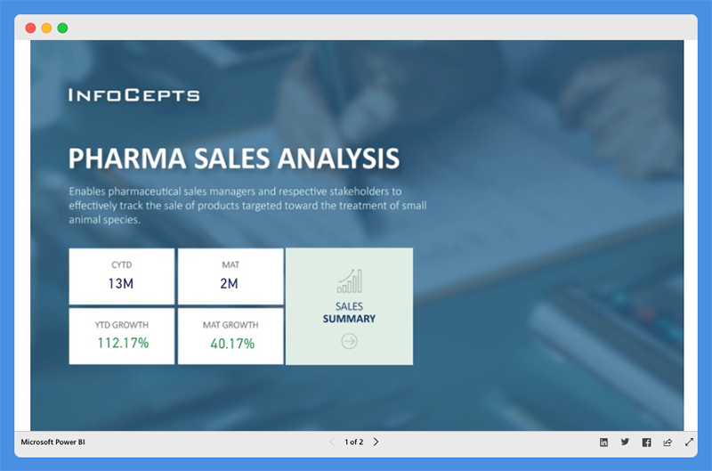
The Pharmaceutical Sales Analysis Dashboard provides an overview of sales for veterinary products. Veterinary professionals can use this chart to track the sale of products used to treat small animal species.
What this Power BI Dashboard Example Does
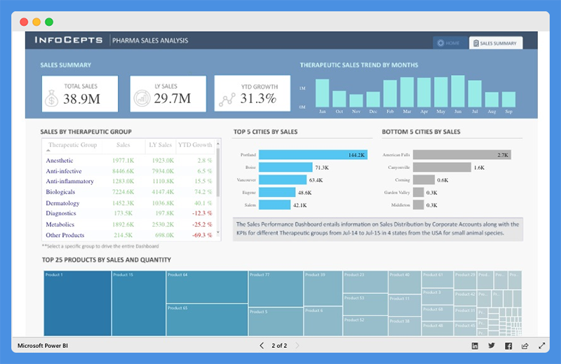
With this sales analysis dashboard, sales manager can analyze product sales for the Top Five Cities and the Bottom Five Cities. Users can view extensive reports on
- Sales by Therapeutic Group
- Top 25 Products by Sales and Quantity
- Therapeutic Sales Trends across any given period
People’s Response to This Power BI Dashboard
- The interactive dashboard has cool data visualizations and offers profound insights.
- Data is visible and arranged.
6. HR Analytics Power BI Dashboard

The HR Analytics Dashboard offers a bird’s eye view of a company’s human resource key metrics including
- Headcount statistics
- Financial performance & statistics
- Demographic statistics
- Employee details
With this dashboard, organizations can make critical decisions to drive employee productivity.
What this Power BI Dashboard Example Does
This Power BI dashboard provides data insight into headcount statistics. Under this tab, managers can view
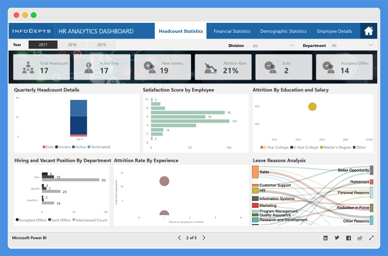
- Total Headcount
- Active Employees
- New Joiners
- Attrition Rate
- Satisfaction Score by Employee
- Attrition Rate by Education, Salary, and Experience
The dashboard offers additional insight into demographic statistics including
- Employee by Location and Demography
- Quarterly Employee Headcounts by Departments
- Total Absenteeism by Department and Leave Type
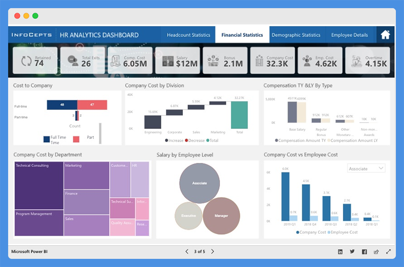
The chart offers an accurate representation of the firm’s finances in terms of

- Cost to Company (CPC),
- Company Cost by Division and Departments
- Compensation, Salary, Bonus, Overtime, and more
It also gives an overview of each employee, including
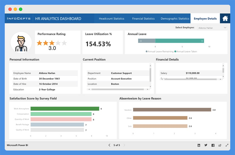
- Performance ratings
- Annual leave report
- Personal information
- Financial performance & details
- Current position
- Absenteeism report
People’s Response to This Dashboard
- Reports and visualizations are pixel perfect.
- The dashboard color theme is visually appealing.
7. Executive Insights Power BI Dashboard
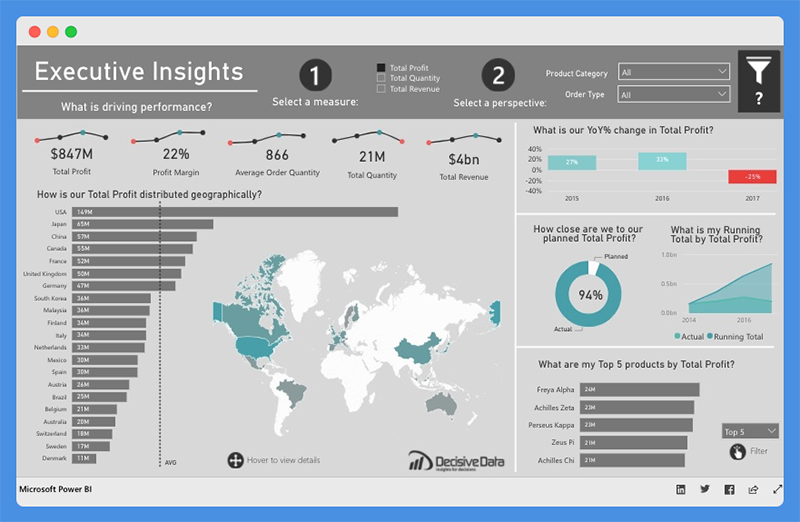
This Power BI intelligence dashboard sheds light on business health and performance. Companies can use this dashboard to explore company-wide data for decision making.
What this Power BI Dashboard Example Does
The Executive Insights dashboard allows companies to view their business from multiple angles based on attributes including
- Products
- Year
- Country
- Order type
The dashboard leverages line charts, donut charts, and custom visuals for analysis. Companies can use filters to tell stories about business elements, like total profit, quantity, and revenue. Users can gain insight into metrics such as
- Profit margin
- Average order quantity
- YOY percentage change in Total Profit
- Top five products by Total Profit, Total Quantity, and Total Revenue
- How Total Profit, Total Quantity, and Total Revenue is distributed geographically
The tool allows users to dig deeper and view company performance based on specific product types.
People’s Response to This Dashboard
- The dashboard offers next-level user interactivity and attractive mapping.
- Clear and easy to understand
8. Inventory Stock Analysis Power BI Dashboard
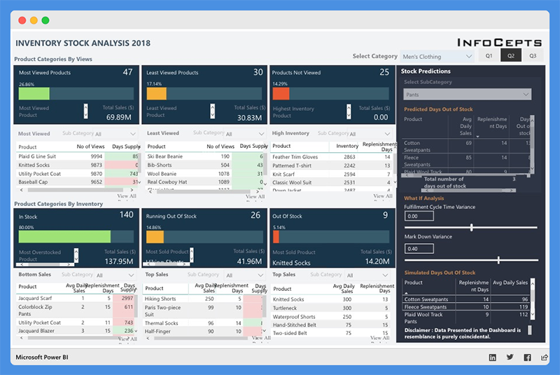
The Inventory Stock Analysis Dashboard provides a clear view of the company’s inventory for the year 2018. Companies can track stock availability and replenish them at the right time.
What this Power BI Dashboard Example Does
The dashboard is broadly categorized into:
- Product Categories by Customer Views and Inventory
- Category Selection – Men’s clothing and Women’s Clothing
- Quarters – First, second, and third quarters
Product Categories by Views are further classified into
- Most Viewed
- Least Viewed
- Products Not Viewed
You can also view Total Sales in USD and percentage-based classification. Product Categories by Inventory are classified into
- In Stock
- Running Out Of Stock
- Out of Stock
For each category, the top five products, number of views, days’ supply, and replenishment days are clearly outlined.
This dashboard also offers insights on Inventory. It divides the top five products into individual categories and segments them into Overall Percentage and Total Sales.
The dashboard offers a stock prediction section. Users can select product subcategories and get data on Average Daily Sales, Replenishment Days, and Days Out of Stock.
You can predict Time to Replenish Stock and Stock Availability based on factors like MarkDown Variance and Fulfillment Cycle.
People’s Response to This Financial Analytics Dashboard
- This financial analytics dashboard is intuitive and covers multiple sections.
9. Electricity Energy Usage and Cost Power BI Dashboard
This Power BI dashboard helps users to estimate the electrical energy they utilize from home appliances. Users can view critical insights about United States Electricity Supply and Cost.
With this dashboard, users can monitor their power consumption and take proactive steps to reduce costs.
What this Dashboard Does
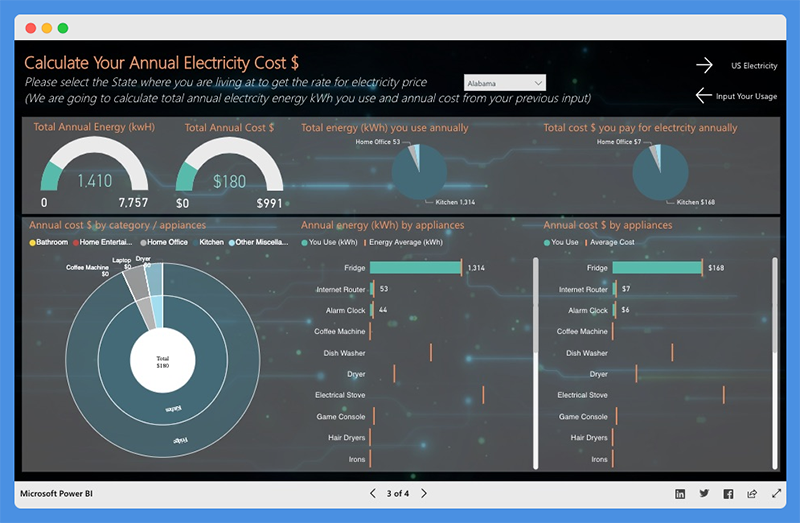
Users can calculate their usage by selecting the appliances they use and how much time they use per day. Then they can choose their state or location to estimate the cost of their electricity bill. The dashboard showcases the following
- Total Annual Energy (kWh)
- Total Annual Cost ($)
- Annual Costs by Category or Appliance
- Annual Energy by Appliance
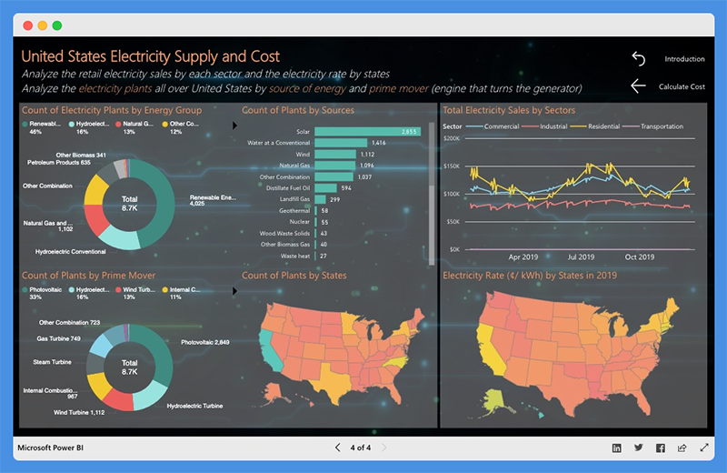
This dashboard gives users a birds-eye view of
- Total Electricity Sales by Sector
- Count of Plants by Sources, Prime Movers, and Energy Group
People’s Response to This Dashboard
- The dashboard provides useful information for everyday use.
- Presentation is accurate and easy to understand
10. Sales Scorecard Power BI Dashboard
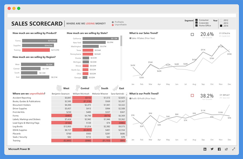
The Sales Scorecard dashboard is another one of the popular Power BI dashboard examples. It helps organizations answer critical questions about sales performance.
This powerful data visualization tool leverages Power BI elements, including shapes, cards, treemaps, and DAX, to build Key Performance Indicators (KPIs) that provide enough details to help sales managers take action.
What this Power BI Sales Scorecard Dashboard Does
This sales dashboard provides vital insight into how much companies are selling per state, region, and product. You can view comparisons of sales and profit against the previous years to put sales performance into perspective.
Managers can view the cost components of the business that are driving profits or losses. Also, they can filter the sales dashboard based on year and business segments.
People’s Response to This Sales Dashboard
- The sales dashboard is interactive and easy to understand.
- The chart helps sales & data analytics teams answer important questions.
11. Social Media Monitoring & Analytics Power BI Dashboard
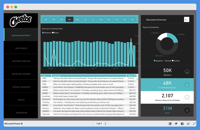
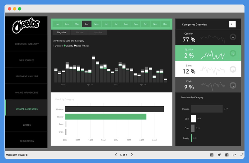
This analytics dashboard is great for marketers, managers, and agencies. With the Social Media Monitoring and Analytics dashboard, you can improve sales, product quality, and crisis control. The tool helps organizations understand the audience’s opinion about their product.
What this Power BI Analytics Dashboard Does
This Power BI analytics dashboard shows monthly data focuses on aspects of social media including
- Discussion Intensity
- Web Sources
- Sentiment Analysis
- Online Influencers
- Special Categories
- Quotes and Geolocation
The Discussion Intensity tab offers critical insight into total reach, mentions on social media, and beyond social media. The chart also shows influencers by volume and impact, amplification, and true reach.
The sentiment analysis highlights User’s Mentions by Day, Hour, and Total mentions. Users can also view the percentage of negative, positive, and neutral mentions.
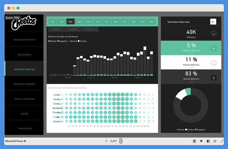
Web sources show the channels from which the mentions emanated, including
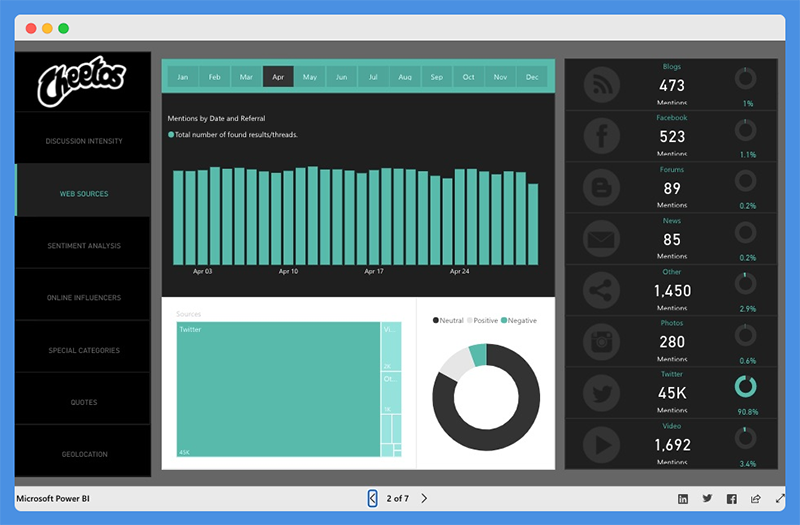
- Blogs
- Photos
- Videos
With this analytics dashboard, users can view positive and negative mentions based on geolocation, including regions and cities.
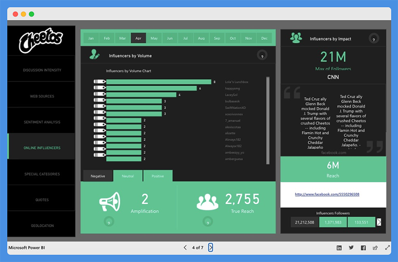
Under the online influencer section, you’ll find influencers broken down by volume and impact across the months of the year. It also shows a breakdown of the influencer’s follower numbers impact, whether it’s negative, positive, or neutral.
People’s Response to This Analytics Dashboard
- The dashboard is stunning and offers critical insight.
- Beautiful dashboard design
12. Attendance Tracker Power BI Dashboard
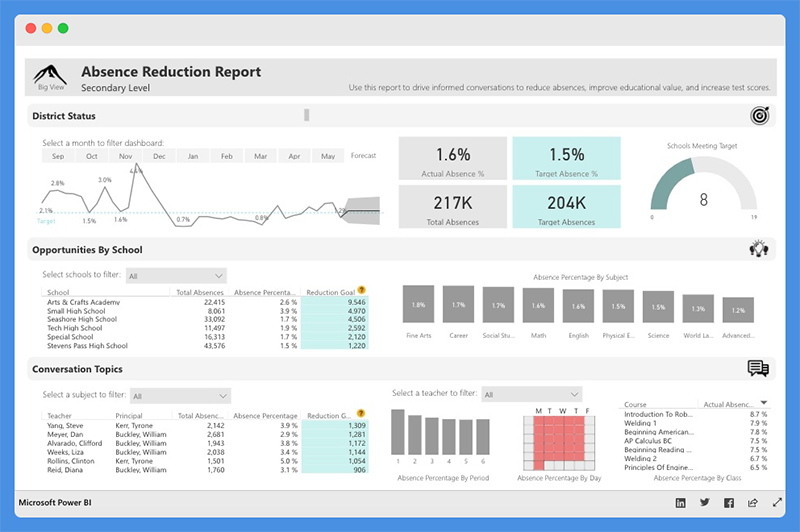
The Attendance Tracker Dashboard helps school administrators track attendance across different teachers, classes, and schools.
This attendance tracker dashboard will drive critical conversations and increased engagement between key stakeholders. With the reports from this dashboard, stakeholders can increase attendance and improve performance in the educational sector.
What this Dashboard Does
The dashboard shows the Absence Percentage by Subject, Courses, Period, and Day. Users can gain insight into the percentage of Actual and Target Absence, Total Absences, and Target Absences.
The District Status section provides high-level insight into attendance trends and goals. The line chart highlights Actuals compared to Target over time. Plus, the chart offers a predicted range for future months.
The chart also shows data about Opportunities by School. This section will help administrators target the most critical schools to work with. The most critical schools have the highest opportunity for Absence Reduction.
The Conversation Topics section provides insight into relevant information such as subject, course, period, and days of the week.
With this data, school administrators can reach out to teachers on an individual basis and increase educational value.
People’s Response to This Power BI template
- Excellent and Insightful dashboard for teachers and administrators.
- The dashboard provides valuable insights at a district level to create action and development plans for teachers, schools, and specific periods and subjects.
13. Team Performance vs. Target Power BI Dashboard
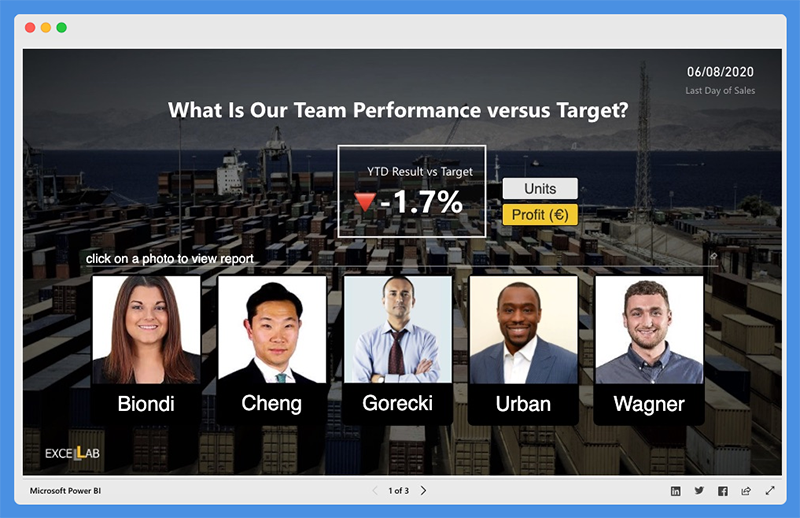
The Team Performance vs. Target dashboard highlights the performance level against set targets for business teams.
With the insight from this dashboard, business leaders can share targets with teams daily, and evaluate how they score against their goal.
Managers can uncover areas for improvement and require more push, products, and customers that sales teams should focus on.
This dashboard shows you the targets and bonuses that are within reach. It uses drill-throughs and bookmarks to organize the content.
Users can move fluently between pages, switch between visuals using toggle) and drill down on Sales Reps, Products, and Customers.
What this Data Analytics Dashboard Does

The first page of the dashboard shows the percentage of YTD Results Vs. Target. You can click on a team member’s photo to view their Sales Rep Bookmark.
For each sales rep, you can select metrics (Units or Profits). Also, you can select Period to analyze and understand long and short term trends.
Also, this data analytics dashboard allows users to switch between Bar and Map visuals using the toggle image, view non-profitable customers, and more.
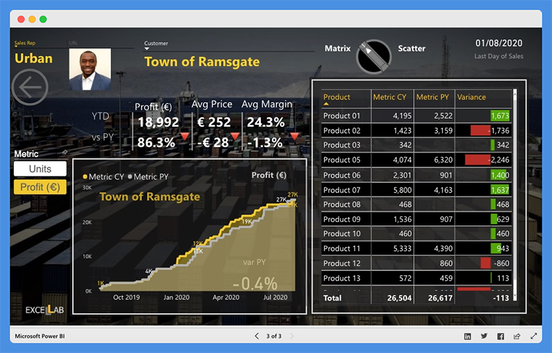
Users can compare Performance and Target Cumulative Variance for all customers. You can right-click on the bar chart to open Customer Bookmark and drill through customers.
This dashboard shows you profit, average price, and average margin within a location. Users can switch between Scatter and Matrix visuals using Toggle and identify product and sales opportunities within customers.
People’s Response to This Dashboard
- The data visualizations are innovative and well-customized.
- The dashboard is easy to understand.
14. NFL Fantasy Football Player Comparison Power BI Dashboard
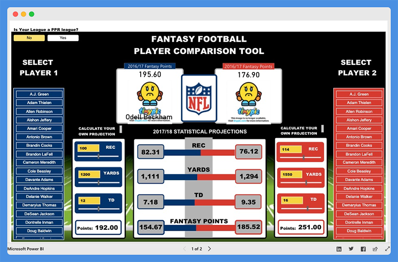
This Microsoft Power BI dashboard helps users prepare their fantasy draft for the new NFL season. The dashboard draws its data from the NFL Fantasy Football player projection and the NFL player stats. Games and NFL enthusiasts use this dashboard to make accurate predictions and secure winnings.
What this Dashboard Does
You can use this Fantasy football player comparison tool by selecting player one and player two from the lists provided. The Power BI report allows users to compare players by viewing critical players’ stats. You can view stats including
- Total fantasy points for the previous season
- Projected receptions
- Yards and touchdowns for the upcoming season
- Current season’s NFL.com predicted points total
The dashboard includes “What Ifs” to allow the user to create their player projections. Under the sections ‘Calculate Your Projection,’ you can adjust the selected player’s receptions, touchdowns, and yards numbers to see how it will impact their overall fantasy points. The scoring for this dashboard is based on the standard NFL.com fantasy scoring system.
Furthermore, this dashboard includes an option for PPR (points per reception) leagues. If your league is a PPR league, you can select ‘Yes’ in the top left corner. The overall points calculation will take into account the added points for each of the player’s receptions.
People’s Response to This Dashboard
- Fantastic dashboard design layout
- Excellent use of the player images
15. Seattle’s Construction Climate Power BI Dashboard
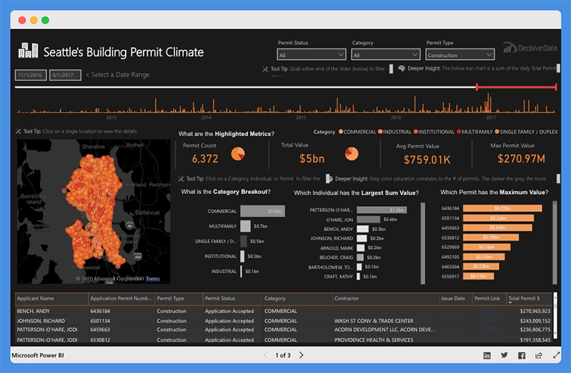
This Power BI dashboard visually captures and presents the growth of Seattle’s Construction industry. The dashboard is powered by data from the Seattle Building Permits dataset.
The building permit data offers profound insight and paints a clear picture of industry growth. It also provides a sneak preview into the future of Seattle’s construction climate.
This dashboard is valuable for
- Construction salespeople researching prospective sites
- Contractors investigating the competition’s strategy
- Managers and CEOs that are making critical decisions on how to pivot their business
Seattle’s Construction Climate dashboard provides a deeper understanding of the market. Also, it enables you to drill down into major details and research specific events.
What this Dashboard Does
This dashboard is divided into three tabs. These tabs provide answers to critical questions.
For the Building Climate Overview Tab
- The top bar chart shows the increase in pace and amount of investment with time.
- The map highlights the investment concentration in specific locations. It also shows how the concentration is affected by Individual, Contractor, or Category.
- The Highlighted Metrics section provides insight into market status. It shows the Permit Count, Total Value, Average Permit Value, and Maximum Permit Value.
- The Middle Bar Chart shows categories that have the highest breakout. It also displays the individuals with the Largest Sum Value and Permits leading the market.
Contractor Competition Tab
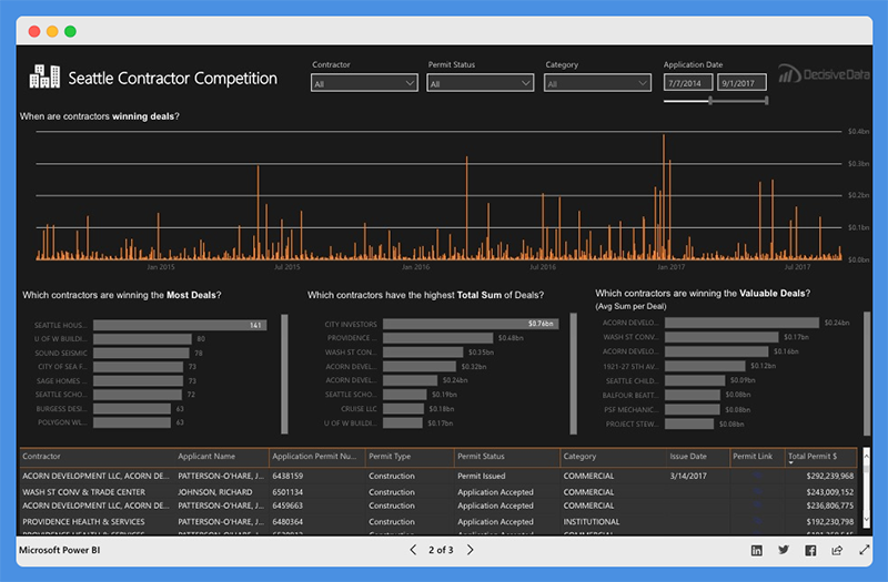
- The top line charts show the trending deal amounts and frequencies.
- The middle bar charts show contractors that are winning the most deals. It also shows which contractors have the highest Total Sum of Deals. You can also see which contractors are leading the market based on size, quantity, size, value
Category Growth Tab
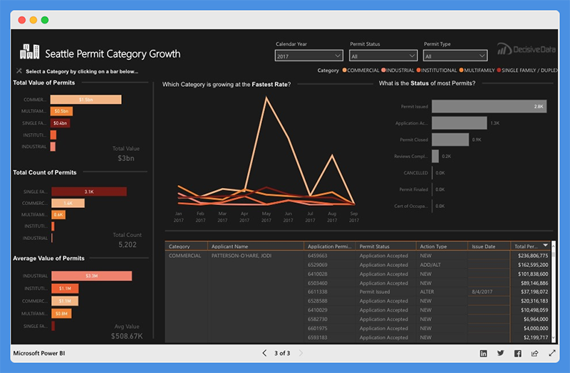
- The left bar chart showcases the Total Value of Permit, Total Count of Permits, and Average Permit Value for each category.
- The line chart shows which category at the fastest rate and total Value growth trend and permit status.
- The right bar chart shows the status of most permits.
This dashboard is easy to operate. You can select the parameters that fit your situation. Also, you can adjust the time frame using the top slider bar.
Dashboard Filterable Fields
The filterable fields in this dashboard include the
- Permit Status – Application, review, and inspection lifecycle
- Permit Type – This refers to Activities covered by the permit (Construction, Site Development, and Demolition)
- Category – Industrial, Commercial, Institutional, Single Family or Duplex, and Multifamily
- Contractors associated with a permit
People’s Response to This Dashboard
- The dashboard shifts the focus from data complexities to the design elements and visual flow.
- The dashboard is attractive, intuitive, and easy to understand.
- Users can easily find critical insights and make decisions quickly.
What Makes a Good Power BI Dashboard?
You can build a Power BI dashboard that doesn’t just look good but also drives action. You’ve got to focus on more than just fancy visuals. We’re talking about elements that go from turning raw data into crystal-clear decisions.
-
Visuals That Mean Business: Pick visuals that get straight to the point. No fluff. They should make your data not just readable but actionable. Keep it clutter-free.
-
Insights That Matter: Zero in on the KPIs and metrics that align with your business goals. Your dashboard should be a decision-making tool, not just a pretty picture.
-
Easy Navigation: Your dashboard should be a breeze to navigate. Design it so users can quickly jump to different sections and dig deep into the details.
-
Design Consistency: Stick to a design theme. Use a cohesive color scheme, fonts, and layout to keep things streamlined and professional (Microsoft).
-
Be Responsive and Interactive: Make sure your dashboard plays nice with different screen sizes and devices. Add interactive elements like slicers and tooltips to keep users engaged.
-
Keep Data Fresh: What’s worse than outdated data? Make sure your dashboard always reflects the current state of affairs. Regular data refreshes are a must.
-
Optimize Performance: Keep your dashboard snappy by minimizing the number of visuals and cutting down on unnecessary interactions. Stick to Microsoft-certified visuals for optimum performance.
-
Know Your Audience: Last but not least, tailor your dashboard to the people who’ll actually use it. Understand their goals and metrics to deliver a tool that’s genuinely useful to them (Microsoft).
By nailing these elements, you’ll create a Power BI dashboard that’s not just eye-catching but a serious asset for data-driven decision-making.
What are Some Common Mistakes to Avoid When Designing a Power BI dashboard?
If you want your Power BI dashboard to be a decision-making powerhouse, then dodge these all-too-common pitfalls. These mistakes can turn your dashboard from a help to a hindrance.
-
Don’t Botch the Charts: Picking the wrong visuals is like bringing a knife to a gunfight. Choose charts that make your data instantly understandable.
-
Skip the Clutter: Overloading your dashboard is a one-way ticket to Confusionville. Keep it streamlined and focused (Microsoft).
-
Color with Caution: Inconsistent colors are distracting and unprofessional. Stick to a cohesive color palette throughout your dashboard (Microsoft).
-
Show the Bigger Picture: Omitting variances and trends is like serving a cake without icing. Give your data the context it deserves.
-
Data Quality Isn’t Optional: Using sketchy or outdated data is a no-go. Ensure your data is reliable and current.
-
Use Slicers Sparingly: Don’t go overboard with slicers. Keep them to a minimum and only where they add value.
-
Consistency is King: Mixing fonts, colors, and layouts is a rookie mistake. Keep the design uniform across all pages of your dashboard.
By steering clear of these blunders, you’re on the fast track to building a Power BI dashboard that doesn’t just look good but is a bona fide decision-making tool.
Best Power BI Dashboard Examples – Wrap-Up
Power BI is one of the powerful data visualization tools offered by Microsoft that enables users to create interactive visual reports and dashboards from their data. Power BI allows users to connect to multiple data sources and analyze data.
In the guide above, we have reviewed some of the best Power BI dashboard examples. Use of Power BI dashboards cut across multiple industries and can be used for several purposes.
Business leaders use Power BI dashboards to track sales and marketing, Key Performance Indicators (KPIs), human resource analytics, inventory, and more.
Business teams can collaborate on the same data, reports, and share insights across Microsoft Office applications such as Microsoft Excel and Teams. Users can promote insights across the organization while maintaining data consistency, accuracy, and security.
With intuitive Power BI dashboards and Power BI reports, businesses can visualize their data and uncover deep insights. The dashboard provides insights into business performance and answers to business questions.
You should use Power BI dashboards to make data-driven decisions that will put your business in the driver’s seat.
Tom loves to write on technology, e-commerce & internet marketing. I started my first e-commerce company in college, designing and selling t-shirts for my campus bar crawl using print-on-demand. Having successfully established multiple 6 & 7-figure e-commerce businesses (in women’s fashion and hiking gear), I think I can share a tip or 2 to help you succeed.